| front |1 |2 |3 |4 |5 |6 |7 |8 |9 |10 |11 |12 |13 |14 |15 |16 |17 |18 |19 |20 |21 |22 |23 |24 |25 |26 |27 |28 |29 |30 |31 |review |
 |
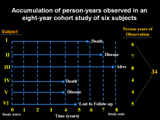
This diagram illustrates how person-time-at-risk is calculated for a cohort of subjects, where the cohort is the group of individuals who share a common putative risk exposure like work in a coal mine or tobacco smoking. |